| *featured, #data-science, #python, #project | |||
Københavns Luftkvalitet og CyklingCopenhagen Air Quality and Bicycling |
|||
Dataset retrieved from: Utrecht University & Google, 2021, via Google Environmental Insights Explorer (August 2021)
The Jupyter notebook used to do this analysis is available here as a Binder and here as a Gist for you to explore!
Introduction
I used to be a bicycle taxi driver, and I remember coming home after a day of work covered in soot from riding along the roads all day. It was a gross, yet kind of fascinating, experience to realize that not only was this stuff in the air covering my skin, I was also spending the day breathing it in.
Due to global warming, our consciousness is ever-focused on air pollution; especially within our cities. Many cities are, therefore, attempting to reduce emissions by reducing the amount of cars on the road and increasing the amount of bikes.
This is old news for cities like Copenhagen, Denmark. Their strong bike culture is only surpassed by their comprehensive bike infrastructure. So when The City of Copenhagen collaborated with Utrecht University and Google to map the city’s air pollution, I was eager to get my hands on the data.
Between November 2018 and February 2020, Google strapped three different air quality sensors on their Street View vehicles and took thousands of measurements throughout the city. Today, we’re going to take a look at the data and start to answer the question: what’s the healthiest bike route between A and B, based on air quality?
Data Ingestion & Initial Aggregation
The data can be found on Open Data DK’s website, and we can use the download link there to pull the .geojson file directly into our project.
url = "https://kkkortdata.spatialsuite.dk/airview/CAV_25May2021.geojson"
remote_data = urllib.request.urlopen(url)
raw_data = gpd.read_file(remote_data)
Let’s take a preview of the data.
raw_data.head()
| FID | Shape_Leng | ROAD_FID | Mixed_NO2 | Mixed_UFP | Mixed_BC | geometry |
|---|---|---|---|---|---|---|
| 0 | 58.821698 | 1 | -999999 | -999999 | -999999.0 | LINESTRING (12.57828 55.69392, 12.57752 55.69423) |
| 1 | 31.898519 | 2 | 10 | 18500 | 0.8 | LINESTRING (12.62463 55.63461, 12.62473 55.63433) |
| 2 | 36.276259 | 3 | 9 | 12800 | 0.8 | LINESTRING (12.58604 55.60184, 12.58595 55.602… |
| 3 | 40.416066 | 4 | 9 | 10700 | 0.7 | LINESTRING (12.58629 55.59317, 12.58569 55.59305) |
| 4 | 32.734397 | 5 | 13 | 14500 | 1.1 | LINESTRING (12.58135 55.59200, 12.58130 55.59171) |
The measurements have the following units:
- Black Carbon: μg/m³
- Nitrogen Dioxide: μg/m³
- Ultrafine Particles: particles/cm³
The Open Data DK site mentions that “some missing data points are listed in datasets as -999999”, so we’ll go ahead and remove any rows in our data that contain this value.
Note that we could change this value to, let’s say, 0, however, 0 will mean something very specific when we look at the distribution later. We could also be sure not to remove the entire row if only one data point is missing, but for my initial analysis, I’m opting to more simply get rid of everything to keep all Series in the DataFrame the same dimension.
cleaned_data = raw_data.drop(raw_data[(raw_data.Mixed_BC == -999999) | (raw_data.Mixed_NO2 == -999999) | (raw_data.Mixed_UFP == -999999)].index)
Now we can look at the correlation between each measurement. I assume there’s a strong correlation: “where there’s high concentration of air pollution of type ‘x’, there’s probably a high concentration of air pollution of type ‘y’”, but it’s always good to check assumptions.
cleaned_data[["Mixed_BC", "Mixed_NO2", "Mixed_UFP"]].corr()
| — | Mixed_BC | Mixed_NO2 | Mixed_UFP |
| Mixed_BC | 1.000000 | 0.938192 | 0.790519 |
| Mixed_NO2 | 0.938192 | 1.000000 | 0.702058 |
| Mixed_UFP | 0.790519 | 0.702058 | 1.000000 |
And we can take a look at another statistic that might be interesting, the overall mean:
cleaned_data[["Mixed_NO2", "Mixed_UFP", "Mixed_BC"]].mean()
Mixed_NO2       17.572950
Mixed_UFP    14280.222977
Mixed_BC         1.131806
dtype: float64
It’s worth noting that these averages are similar to the ones published on Google’s project site, which gives me a pretty good confidence that I’ve loaded the data correctly. The difference between my results and theirs may be that fact that I likely dropped some data while doing cleanup.
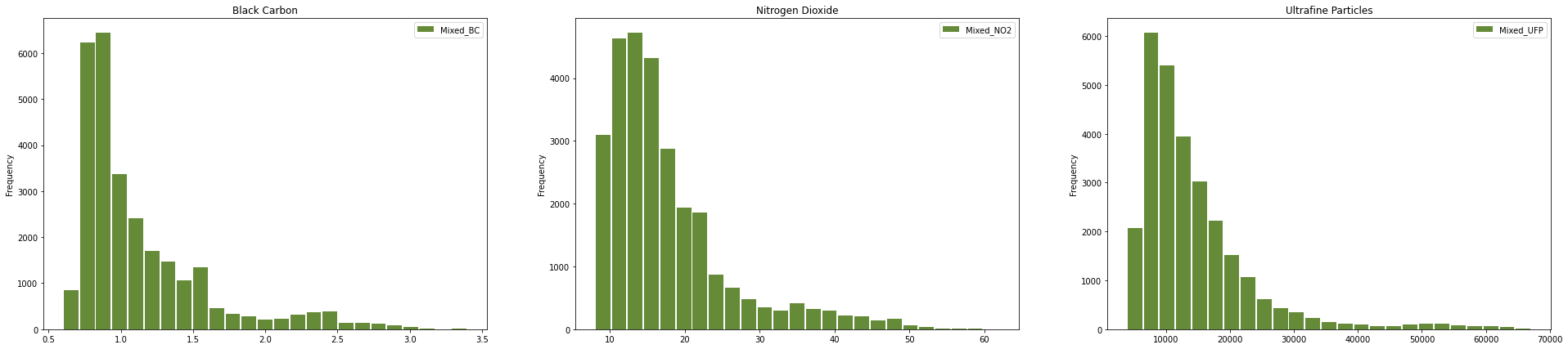
Google also shows the distributions of the amounts of pollutant per road section, so we can go ahead and look at that too.
fig, ax = plt.subplots(nrows=1, ncols=3, figsize=(33, 7))

ax[0].title.set_text("Black Carbon")
cleaned_data.Mixed_BC.plot.hist(bins=25, color="xkcd:moss green", rwidth=0.9, ax=ax[0], legend=True)

ax[1].title.set_text("Nitrogen Dioxide")
cleaned_data.Mixed_NO2.plot.hist(bins=25, color="xkcd:moss green", rwidth=0.9, ax=ax[1], legend=True)

ax[2].title.set_text("Ultrafine Particles")
cleaned_data.Mixed_UFP.plot.hist(bins=25, color="xkcd:moss green", rwidth=0.9, ax=ax[2], legend=True)
Now for the interesting bit: let’s take a look at a map of the data. GeoPandas quickly lets you plot a Series or DataFrame containing geometries that it created based on the geojson data we imported.
fig, ax = plt.subplots(nrows=1, ncols=3, figsize=(33, 21))

ax[0].title.set_text("Black Carbon")
ax[0].set_facecolor("xkcd:grey")
cleaned_data.plot(column="Mixed_BC", ax=ax[0], legend=True, legend_kwds={'label': "Black Carbon", "orientation": "horizontal"}, cmap="YlOrRd")

ax[1].title.set_text("Nitrogen Dioxide")
ax[1].set_facecolor("xkcd:grey")
cleaned_data.plot(column="Mixed_NO2", ax=ax[1], legend=True, legend_kwds={'label': "Nitrogen Dioxide", "orientation": "horizontal"}, cmap="YlOrRd")

ax[2].title.set_text("Ultrafine Particles")
ax[2].set_facecolor("xkcd:grey")
cleaned_data.plot(column="Mixed_UFP", ax=ax[2], legend=True, legend_kwds={'label': "Ultrafine Particles", "orientation": "horizontal"}, cmap="YlOrRd")
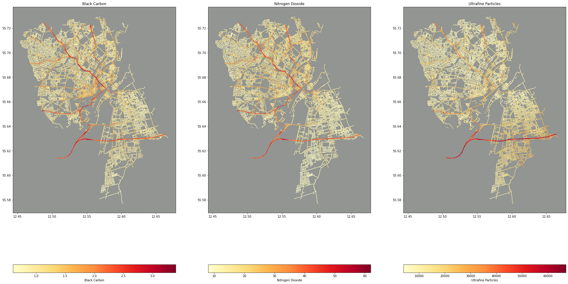
I love these maps! One, I think they’re beautiful (thank you matplotlib!) and two, It’s fascinating that there’s no underlying map of Copenhagen here. The streets represent the data points and only the streets represented in the data are projected onto the plot/map.
Route Querying & Data Joining
Querying for a route is done via the Google Maps API, or more specifically, the Google Maps Python client library. In this example, we’re being sure to use bicycling as the mode so that Google Maps knows to optimize for bicycling routes. It would also be interesting to query for walking routes!
gmaps = googlemaps.Client(key=GOOGLE_DIRECTIONS_API_KEY)
starting_location =  "Øste Gasvæk Teater"
ending_location = "Copenhagen Boulders"

try:
  directions_result = gmaps.directions(starting_location, ending_location, mode="bicycling")
except googlemaps.exceptions.ApiError:
  print("It's likely that Google cannot find one or both locations that you've entered")

if not directions_result:
  print("It's likely that Google cannot find one or both locations that you've entered")
The JSON returned from the API has a ton of information that you might need to display the route to the user: HTML snippets, warnings/cautions, street names, and even landmarks! However, we don’t need any of that. The only thing we’re interested in is the “polyline.” Google Polylines are encoded latitude/longitude pairs. This line encodes the geometries of the entire route. As an example, here is the polyline of the route we’ll look at below:
{x_sIskxkAAuFDKvAG^E?_@@mB?_BB]Lc@T_@POz@]dG{BrJyDnBu@f@Wz@o@fAo@^QdAYxBa@zCoAdGyDjDwBz@g@rAe@dAWjD_@jBOh@B`@FFHNJn@p@nB~CzAdCrBjD~AnClAxBpA~BTp@hApBPTTNLQb@cAZs@v@oBVqANe@p@{A|@kBP_@b@i@|@aAVMd@OpAk@hDsAfCaAjEcB|Ao@nB~ArBdBfCtBlCvBlFbEbDnC|CbCpB~APNNBJFl@b@LFt@C~@U|@e@zAY`AWJI|@W|Ae@DBF?`@KZCJ@DQBILUpAm@PMj@QNEjC{@b@Sd@QjA[n@NVTr@zAzA|DXhARdA`@rDZtCZzAfAbEd@~Ax@~ArAlCbFrKrAnCZl@JZVfBHt@Nb@pEtJbCdFbBvDnBhEdKtYzAlEp@fBTj@B\\Hp@`@hA`DdJx@lCt@tBj@`Br@|Bt@`CnApDDHLB`@BVf@T^b@n@`@b@bAn@h@Rr@Rd@FrAJhDJr@Jp@Vr@f@j@n@r@lAP\\Xt@\\xANxAd@nFZ`Ef@rGb@tGf@`GFf@NvATtDTfDHfAZ~Bl@rC`@tAn@rAj@v@nD`DbAv@xAbA`BvAl@j@rDjDz@v@\\RHDf@D~DcBhD{ArD_BjBy@p@QhBu@vBw@b@M|@g@Lt@r@z@fFvF|@t@jAv@z@`@n@Rp@PZDlAL`A?hAIlB]
We capture this in a variable
pline = directions_result[0]['overview_polyline']['points']
And then use the polyline library to decode it as geojson, or more specifically, as long/lat pairs that can be fed into a GeoPandas DataFrame:
decoded_polyline = polyline.decode(pline, geojson=True)
route_data = pd.DataFrame(decoded_polyline, columns=["x","y"])

route = gpd.GeoDataFrame(route_data, geometry=gpd.points_from_xy(route_data['x'], route_data['y']), crs=cleaned_data.crs)
We can then use the route data to overlay onto our original map. We do this by using a spatial index built by GeoPandas using RTree to quickly query based on a spatial predicate. In this case, we’re looking for all data points that are covered by a box that fits around our route.
route_boundary = shapely.geometry.box(*route.total_bounds).buffer(0.01)
overlap = cleaned_data.iloc[cleaned_data.sindex.query(route_boundary, predicate='covers')]
fig, ax = plt.subplots(nrows=1, ncols=2, figsize=(33,21))

ax[0].set_aspect('equal')
ax[0].set_facecolor("xkcd:grey")
cleaned_data.plot(ax=ax[0], column="Mixed_UFP", cmap="YlOrRd")
route.plot(ax=ax[0], marker='o', color='yellow', markersize=50)

ax[1].set_aspect('equal')
ax[1].set_facecolor("xkcd:grey")
overlap.plot(ax=ax[1], column="Mixed_UFP", cmap="YlOrRd")
route.plot(ax=ax[1], marker='o', color='blue', markersize=100)

plt.show()
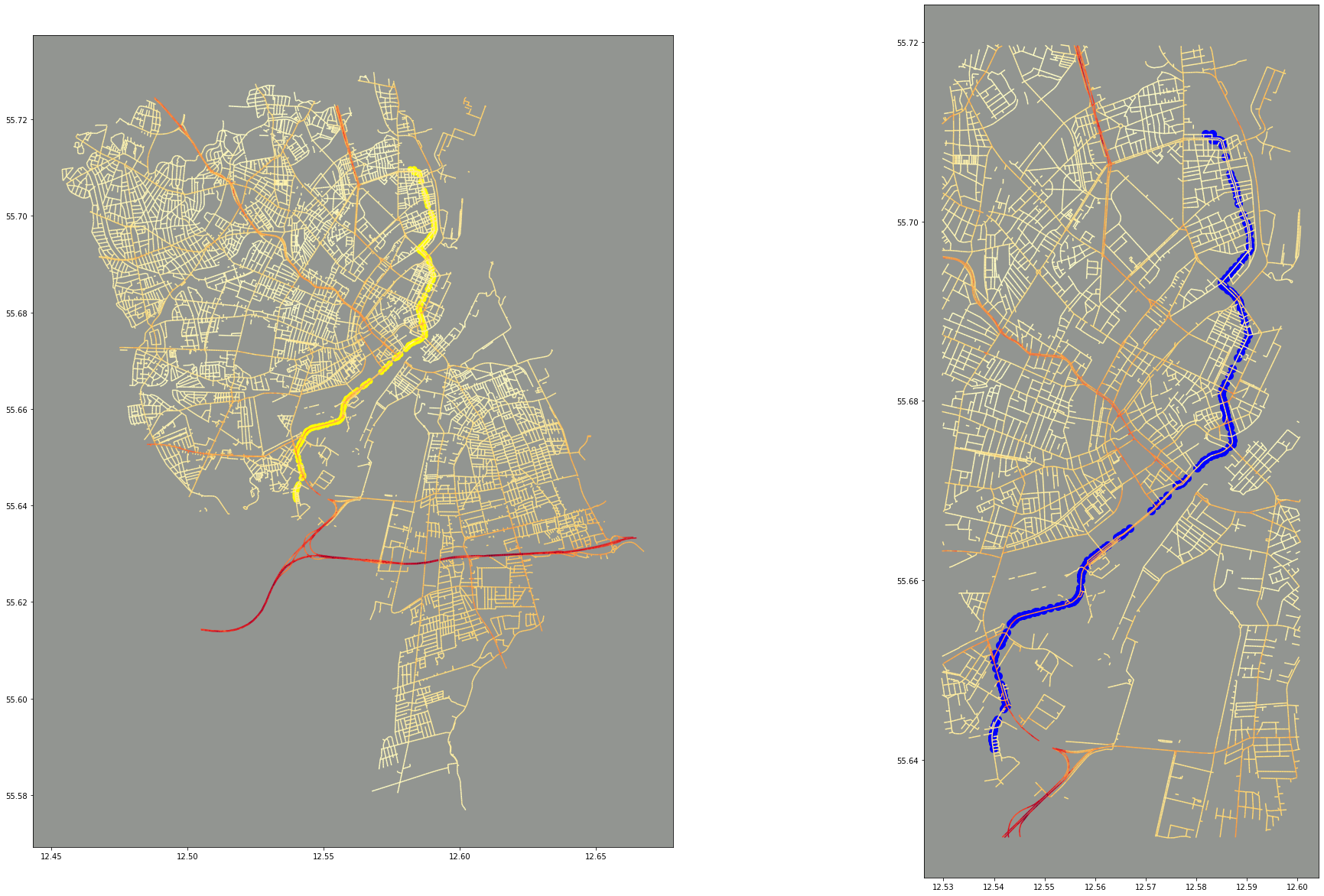
This is primarily for visual reasons: to see the route placed onto the map, and to also provide a “zoomed in” version. A zoomed in version would be easier with an interactive mapping library, such as Plotly, but there’s no reason we can’t use a little bit of geometric querying to help us!
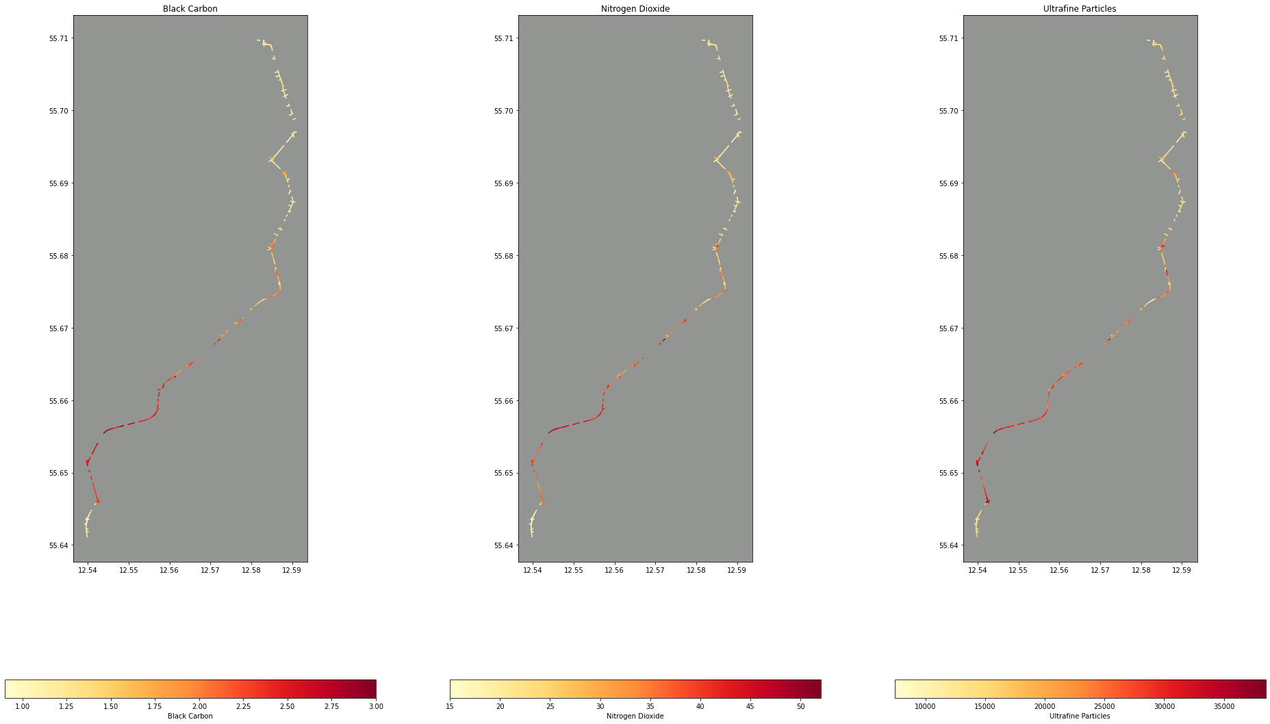
Next, for what I’m really interested in: which of our air quality data points intersect with our route. Here, I’m buffering the route geometry by a tiny amount to turn it from a 1D point geometry to a 2D polygon. This is because the precision on the longitude and latitude coordinates (and thus the geometry coordinates) is so high, I often found that the points from the route and the lines from the air quality data wouldn’t intersect at all!
intersections = cleaned_data.iloc[cleaned_data.sindex.query_bulk(route.geometry.buffer(0.0001), predicate='intersects')[1]]

fig, ax = plt.subplots(nrows=1, ncols=3, figsize=(33, 21))

ax[0].title.set_text("Black Carbon")
ax[0].set_facecolor("xkcd:grey")
intersections.plot(column="Mixed_BC", ax=ax[0], legend=True, legend_kwds={'label': "Black Carbon", "orientation": "horizontal"}, cmap="YlOrRd")

ax[1].title.set_text("Nitrogen Dioxide")
ax[1].set_facecolor("xkcd:grey")
intersections.plot(column="Mixed_NO2", ax=ax[1], legend=True, legend_kwds={'label': "Nitrogen Dioxide", "orientation": "horizontal"}, cmap="YlOrRd")

ax[2].title.set_text("Ultrafine Particles")
ax[2].set_facecolor("xkcd:grey")
intersections.plot(column="Mixed_UFP", ax=ax[2], legend=True, legend_kwds={'label': "Ultrafine Particles", "orientation": "horizontal"}, cmap="YlOrRd")
Now with this data, we can aggregate the air quality data filtered by the route to get some meaningful statistics like how many times more polluted is our route compared to the average:
(intersections[["Mixed_NO2", "Mixed_UFP", "Mixed_BC"]].mean() / cleaned_data[["Mixed_NO2", "Mixed_UFP", "Mixed_BC"]].mean())
Mixed_NO2    1.637403
Mixed_UFP    1.432781
Mixed_BC     1.518163
dtype: float64
Or what’s the maximum average exposure along the route:
intersections[["Mixed_NO2", "Mixed_UFP", "Mixed_BC"]].max()
Mixed_NO2       52.0
Mixed_UFP    38500.0
Mixed_BC         3.0
dtype: float64
Next Steps
The Jupyter notebook used to do this analysis is available here as a Binder and here as a Gist for you to explore!
Some interesting ideas:
- Exposure amounts based on time. The Google Maps API returns a Polyline and duration for each part of the trip!
- Using machine learning to fill in gaps in data, what about those
-999999data points or roads that aren’t represented at all? - Are there correlations between this data and any other data available at https://opendata.dk? Housing prices? Bike parking?